React
[React] styled-components를 활용한 재사용 컴포넌트 만들기(with. TypeScript)
dev_seon
2022. 9. 30. 14:13
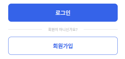
진행 중인 프로젝트에서 사용되는 대부분의 버튼의 형태가 위 이미지와 같은 디자인이였습니다.
때문에 같은 코드를 반복적으로 작성하기 보다는 공통적으로 사용하는 버튼을 BasicButton이라는 컴포넌트로 만들어 재사용하기로 했습니다.
먼저, 기본적으로 가장 많이 사용되는 버튼의 디자인은 로그인 버튼과 같은 파란 배경, 하얀 글씨의 디자인이였기 때문에 다음과 다음과 같이 코드를 작성했습니다.
// BasicButton.tsx
interface Props extends ButtonHTMLAttributes<HTMLButtonElement> {
	children: React.ReactNode;
	onClick?: () => void;
}

const BasicButton = ({ children, ...props }: Props) => {
	return (
		<StyledButton {...props}>
			{children}
		</StyledButton>
	);
};

export default BasicButton;

const StyledButton = styled.button`
	display: flex;
	justify-content: center;
	align-items: center;
	width: 100%;
	padding: 10px 20px;
	border: 1px solid ${theme.colors.blueMain};
	border-radius: 10px;
	background-color: ${theme.colors.blueMain};
	color: white;
	font-size: 24px;
	font-weight: 600;
	cursor: pointer;
`;
이 때 회원가입 버튼의 경우 로그인 버튼과 비교하여 글자색과 배경색만 다른 형태였기 때문에 흰 배경, 파란 글씨의 추가 컴포넌트를 생성하기 보다는 이미 만들어 두었던 BasicButton 컴포넌트에 mode라는 props를 지정하여 글자색과 배경색을 mode에 맞게 설정하는 방식으로 BasicButton 컴포넌트를 수정했습니다.
또한, 버튼이 disabled 된 경우 글자색, 배경색, 테두리색을 다르게 설정하고자 했고, disabled 또한 BasicButton 컴포넌트의 props로 지정하여 최종적으로 다음과 같은 재사용 컴포넌트를 만들게 되었습니다.
interface Props extends ButtonHTMLAttributes<HTMLButtonElement> {
	children: React.ReactNode;
	disabled?: boolean;
	mode?: 'basic' | 'white';
	onClick?: () => void;
}

const BasicButton = ({
	mode = 'basic', // mode의 default function parameter는 basic으로 지정
	disabled,
	children,
	...props
}: Props) => {
	return (
		<StyledButton mode={mode} disabled={disabled} {...props}>
			{children}
		</StyledButton>
	);
};

export default BasicButton;

const StyledButton = styled.button<{ mode: 'basic' | 'white' }>`
	display: flex;
	justify-content: center;
	align-items: center;
	width: 100%;
	padding: 10px 20px;
	border: 1px solid ${theme.colors.blueMain};
	border-radius: 10px;
	background-color: ${(props) =>
		props.mode === 'basic' ? theme.colors.blueMain : 'white'};
	color: ${(props) =>
		props.mode === 'basic' ? 'white' : theme.colors.blueMain};
	font-size: 24px;
	font-weight: 600;
	cursor: pointer;

	&:disabled {
		border: 1px solid ${theme.colors.gray300};
		background-color: ${theme.colors.gray100};
		color: ${theme.colors.gray400};
		cursor: default;
	}
`;